
Covent Garden Painters & Decorators
Colour & finish planning
Start with what stays. In a Covent Garden room, brick, oak, stone, upholstery and the lighting are more useful colour references than an isolated paint name. Build a scheme that belongs to those materials.
Discuss your project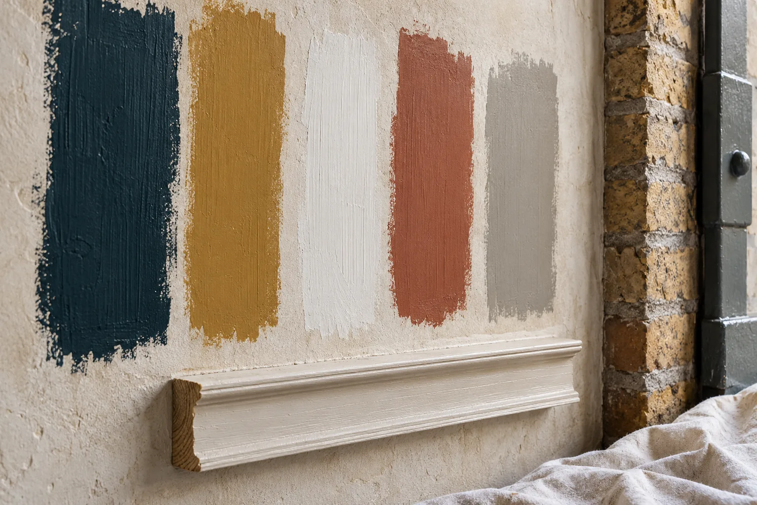
Choose the relationships first
Select the surface that will occupy most of the view, then test the ceiling and joinery against it. An exposed brick wall may sit more comfortably beside a softened mineral tone than a bright white; a dark shopfront may need a lighter entrance reveal. These are design choices to trial at the property, not a prescribed palette for every Covent Garden address.
Sample for different times of day
Move a sample between the window and the inner wall, then look again under the lights used in the evening. For a restaurant, assess it beside table lighting and fixed upholstery. For an office, include the desk surface and screen positions. Give each candidate a product reference and proposed sheen, and record where it was assessed before narrowing the selection.
A public frontage needs a wider view
Westminster’s shopfront guidance treats material, colour, architectural style and the street as connected decisions. Compare an exterior sample with the whole elevation and its neighbours, including any established building-wide scheme. Where permissions or landlord requirements apply, resolve those before ordering. The colour planning exercise should produce a proposal that can be checked, rather than imply that a preferred shade is already authorised.
Turn decisions into a usable schedule
The final record should identify the room or elevation, the component, manufacturer, colour, finish and any approved sample. Mark retained surfaces and unresolved choices clearly. Discuss the extent of sampling and colour support within the proposed commission. Once selections are settled, keep a dated version with the decorating scope so subsequent changes do not rely on recollection.
Sheen, texture and why the same colour shifts
A colour name is incomplete until the sheen and the texture are chosen, because both change what the eye reads. Matt emulsion on a slightly irregular plaster wall softens the light and can hide minor filling. The same pigment in a higher sheen on a door or a lining will look deeper and will show every brush mark the preparation left behind. Eggshell or satin on joinery is often chosen because it can be wiped in a stair or a shop entrance, while a flat finish on the ceiling keeps glare down from a pendant or a track of spots. Sample boards should carry the proposed sheen, not a daub of colour alone, and they should be viewed beside brick, timber, stone or upholstery that will remain. Look again after dark under the lamps the room uses, and in a restaurant look beside the table lights. Write the manufacturer, the colour reference and the sheen on the board itself. A later substitute that is merely close in a daylight photograph is a specification change, and it ought to be agreed before it is applied across a whole elevation or a run of doors.
Established frontage colours and the street around the sample
Interior samples and a street-facing colour are tested against different evidence. Historic England’s redecoration advice asks owners to take account of local controls and of a terrace’s established colour treatment, and it treats that as a check rather than a single palette handed down for every frontage. Westminster’s shopfront guidance connects material, colour, scale and architectural style with the wider street. A door colour or a fascia tone should therefore be held up to the whole elevation: upper sashes, neighbouring frontages, exposed brick and any building-wide scheme the landlord already holds. Photograph the sample in place, note the time of day, and keep that photograph with the product reference. Where the building is listed, or where a conservation-area or Article 4 control may apply, the colour and the preparation are put to the relevant council before tins are ordered. An agreed sample is a proposal that can be checked. It does not by itself authorise a change. The schedule that leaves the consultation names the component, the product, the sheen and the surfaces deliberately left unpainted.
Sources: Historic England: historic paint and redecoration; Westminster: shopfronts, blinds and signs guidance
Questions about Colour & finish planning
What does colour and finish planning include, and what does it not do?
Colour and finish planning produces decisions a decorator can follow in Covent Garden: relationships between surfaces, tested samples, the sheen, and a schedule naming the room or elevation, the component, the manufacturer, the colour and the finish. It marks anything still provisional. It does not, on its own, apply the paint, hang a covering or obtain consent for a frontage. Interior painting, wallpaper, joinery and commercial decorating are where the work is carried out. Use planning when the open question is the sample and the record.
How should colour samples be judged in the building?
Look at a sample beside the materials that will stay, in daylight and under the lights you actually use in the Covent Garden building. Move it from the window to the inner wall. In a restaurant, look again beside the table lighting and the upholstery. In an office, include the desk and where screens sit. A flat card cannot show sheen on a moulding or on uneven plaster, so a board or a discreet patch is more useful when sampling is part of the commission.
What should I send if I want a written finish schedule?
Send photographs of the brick, timber, stone, furnishings and windows that will sit beside the scheme, plus any paint names you are already considering for the Covent Garden address. Say which rooms or elevations are included and which surfaces must not change. Attach a landlord or estate schedule if one exists, and say who else must approve the result, such as a managing agent. For a street-facing colour, include the whole front and note whether you have checked the address on the council’s conservation pages.
Why do sheen and texture have to be chosen with the colour?
The same pigment reads differently in a matt finish on slightly irregular plaster and in a higher sheen on a door. Matt can soften minor filling. A higher sheen can look deeper and will show more of the surface under it. Write the sheen next to the colour name for each component, rather than picking one finish for the whole Covent Garden address. Texture belongs in the same note: brick left exposed, a smooth new lining and an old moulding do not take light in the same way.
Related services
Covent Garden streets for this service
Start with the space
What needs
a new finish?
Tell us whether the work is for a home, a business or a shared building. Include the Covent Garden address, the surfaces involved and the times when access could be available.
Your decorating enquiry
Describe the existing finish, the change you want and any restrictions on working in the space.